Updated August 2026
Purple can feel bold, luxurious, mysterious or wonderfully calming. It is one of those colours that changes completely depending on the shade and the colours around it. Deep aubergine creates drama, soft lavender feels restful, and violet or plum can bring energy to an otherwise neutral room.
If you love purple but are unsure how to use it at home, you do not need to redesign the entire room. A carefully chosen painting, textile or smaller decorative detail can be enough to make the colour feel intentional. The most important thing is to choose a shade that creates the mood you want—and to decorate with colours you genuinely enjoy rather than following a short-lived trend.
What mood does purple create in a room?
Purple combines the calmness of blue with the warmth and energy of red. That is why it can feel peaceful in one room and theatrical in another. Before choosing a palette, think about how you want the space to feel:
- Lavender and lilac feel soft, light and restful.
- Violet and orchid add creativity and personality.
- Plum and aubergine feel rich, intimate and sophisticated.
- Muted mauve creates warmth without demanding too much attention.
A colour does not need to cover every wall to influence the room. Purple can be introduced through one strong focal point, then repeated in one or two smaller details to connect the scheme.

What colours go well with purple?
Purple is more versatile than it first appears. The best pairing depends on whether you want the room to feel fresh, peaceful, playful or dramatic.
Purple with white or cream
White, ivory and warm cream give purple breathing room. They allow a violet painting or decorative accent to stand out without making the space feel heavy. This is one of the easiest combinations for a modern home: keep the large surfaces light, then bring in purple through art, cushions, a chair or a throw.
Purple with green
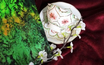
Purple and green are natural partners. Think of lavender, violets or jacaranda blooms surrounded by leaves. Sage and olive create a soft, earthy mood, while emerald or deep forest green makes the palette richer and more dramatic. Houseplants are also an effortless way to add the balancing green element.
Purple with blue or teal
Blue and teal sit close to purple on the colour wheel, so they create a harmonious, layered palette. Pale blue with lavender feels tranquil enough for a bedroom, while teal with plum or violet has more energy and suits a living room or creative space.
Purple with yellow or gold
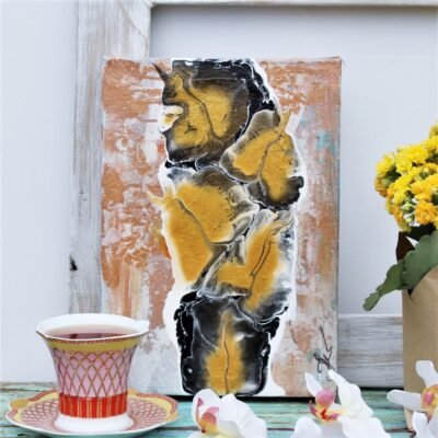
Yellow is purple’s complementary colour, which means the two create lively contrast. You do not need equal amounts of both: a mustard cushion, warm timber, brass frame or gold lamp can bring a purple scheme to life. Metallic gold and bronze also emphasise the luxurious side of deeper purple shades.

Purple with grey or black
Grey makes purple feel contemporary and restrained. A warm grey works beautifully with mauve and plum, while charcoal creates a moody background for brighter violet. Black can be used in smaller amounts—such as frames, furniture legs or lighting—to give the palette definition.
Purple with pink or burgundy
For a warmer, more expressive room, combine purple with blush, dusty pink, berry or burgundy. Keeping the shades at a similar intensity helps them feel related rather than busy. Neutral walls and simple furniture will let this colour-rich combination shine.
How to use purple without overwhelming the room
If you are nervous about decorating with purple, begin with one focal point. It is much easier to build a room around something you love than to collect several unrelated purple objects and hope they work together.
- Choose your main piece. This could be an original painting, an armchair, a rug or a feature wall.
- Pull out two supporting colours. Look for colours already present in the artwork or textile and repeat them elsewhere in the room.
- Repeat purple once or twice. A cushion, vase or small bunch of flowers is usually enough to make the palette feel intentional.
- Add a neutral resting place. White, cream, timber or grey prevents a bold scheme from becoming visually tiring.
- Use different textures. Velvet, linen, glass, metal and painted canvas all reflect colour differently and add depth.
Decorating with purple in different rooms
Living room
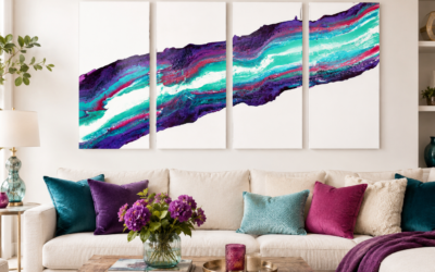
The living room can handle a stronger statement because it is usually a social, energetic space. Try a large purple abstract painting above the sofa, or use one deep violet wall behind neutral furniture. If the artwork contains blue, pink, gold or green, repeat one of those colours in a cushion or decorative object.
Bedroom
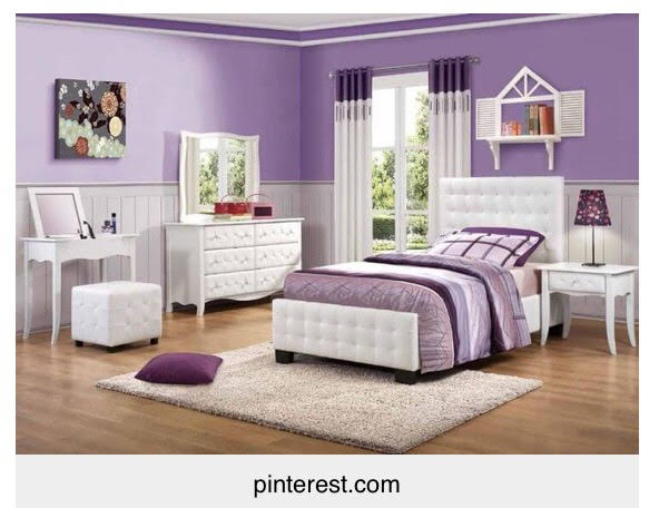
For a restful bedroom, choose lavender, dusty mauve or a blue-toned purple. White bedding and pale timber will keep the room fresh. If you prefer a cocooning effect, use plum or aubergine behind the bed and soften it with cream textiles and warm lighting.

Dining room
Purple can feel particularly elegant in a dining room. Deep walls, velvet chairs or a dramatic painting create atmosphere, especially when combined with glass, brass or warm candlelight. If that feels too bold, begin with artwork and table accessories against a neutral background.

Kitchen or home office
In practical spaces, smaller accents are often enough. Purple ceramics, a painted shelf, a desk chair or a compact artwork can add personality without competing with the room’s function. Kitchens already contain reflective surfaces, so rich violet accessories can look especially vibrant against white, grey or timber cabinetry.

Using abstract art to introduce purple
Original art is one of the most flexible ways to bring colour into a home. Unlike a painted wall or large piece of furniture, a painting can combine several shades and connect colours that already exist in your room.
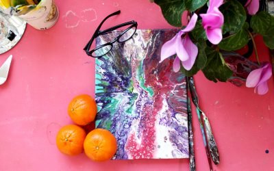
When choosing a purple abstract painting, look beyond the single word “purple”. Notice whether the work leans towards cool blue-violet, warm magenta, soft mauve or deep plum. Then consider the other colours in the painting. White may make it feel lighter, black may add drama, green may create a natural contrast, and gold or yellow may add warmth.
Scale matters too. A larger painting can anchor a room and become the starting point for the entire palette. A smaller work can add a controlled pop of colour to a reading corner, hallway, shelf or gallery wall. If you are unsure about proportions, my guide to choosing abstract art for your home explains how to think about scale, orientation and placement.

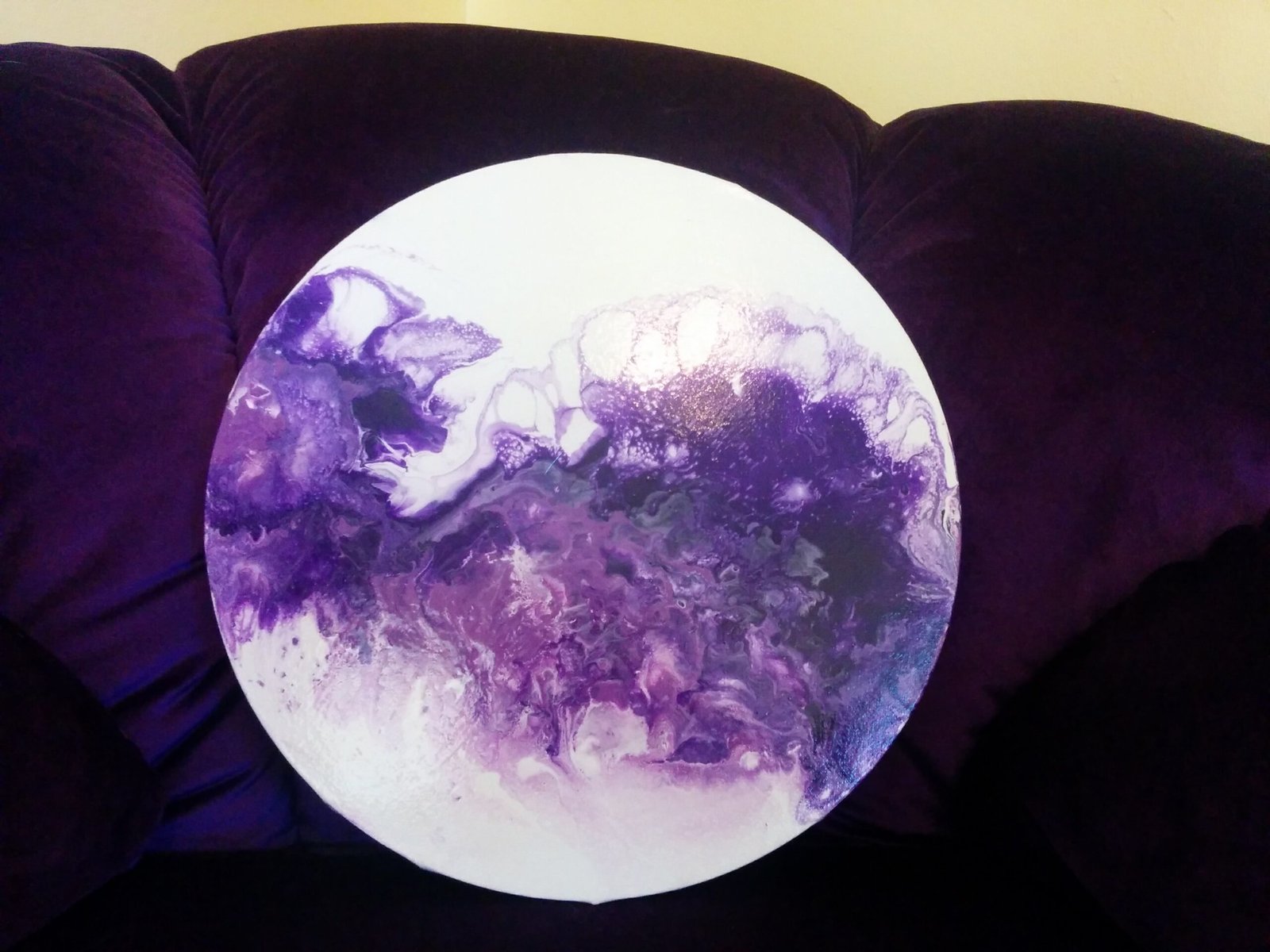
An earlier purple abstract painting by Zhanna, showing how violet can be layered with blue, white and warmer accents.
You can browse available original abstract art in the online gallery. Every original is one of a kind, so once a painting has found a home, that exact piece is no longer available.
Frequently asked questions about decorating with purple
Does purple make a room look dark?
Deep purple can make a room feel darker, particularly if it covers several walls or the space receives little natural light. Balance it with pale surfaces, mirrors and warm lighting, or use it as an accent through artwork and textiles. Lavender and lilac can feel light and airy rather than dark.
What is the easiest colour to pair with purple?
White or warm cream is the simplest place to start because it works with almost every shade of purple. Grey creates a more contemporary look, green feels natural, and gold adds warmth and elegance.
How can I add purple without repainting?
Begin with one purple painting, cushion, throw, vase or chair. Repeat the colour once elsewhere in the room and keep the larger surfaces neutral. This creates a deliberate colour story without a major redesign.
Can purple work in a minimalist home?
Yes. Use one clear purple focal point against a restrained background and avoid adding too many competing accents. A single abstract painting can introduce colour while the furniture, walls and styling remain simple.
Choose the purple you love
Purple does not need to be treated as a trend or used according to strict rules. Start with the shade that makes you feel something, decide how much energy or calm you want in the room, and build a simple palette around it.
If you would like to learn more about the person behind the paintings, meet Zhanna and discover her artistic story. If a particular original catches your eye, the Buyer’s Guide and contact page will help with the next step.
Zhanna Lutova is a painter, designer and art dealer based in Johannesburg, South Africa. From her West Rand studio, she creates richly textured abstract works using acrylics and mixed media, combining pouring, splattering, spinning and other experimental techniques. Drawing on decades of art and fashion design experience, Zhanna believes abstract art invites us to let go of perfectionism and discover our own meaning in every painting.